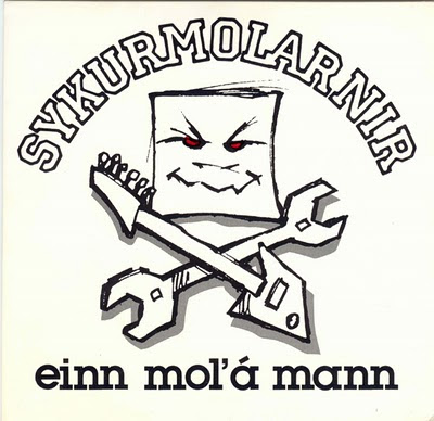
Here's the background of the making the first 7" of The Sugarcubes. The Single was released on 21. November 1986 (the birthday of Björk btw) on the Smekkleysa Label in collaboration with British One Little Indian Label. The pressing was done @ Alfa @ Hafnarfjörður.
Side A: Ammæli (Birthday)
Side a: Köttur (Cat)
Phoebe Jenkins did an interesting analysis of the Smekkleysa Label:Side a: Köttur (Cat)
"The production of Sykurmolarnir/The Sugarcubes’ first single, Einn Mol’á Mann, is just one example of many of their profit making methods. When 500 copies of the single came back from production in Hafnarfjördur, they soon discovered that only half of them worked. It was at Bragi’s home that they played over every single record, one after the other, to discover which ones were faulty. Only 250 of them were sellable. They then had to glue the record covers by hand and on top of that colour the eyes of the sugar cube man on the cover red because this had been over-looked when sending them to the printers . They sold the singles from the back of Fridrik’s car on Austurstræti. Unfortunately it didn’t sell well and it was not until both Melody Maker and NME put them on their front covers that the Sugarcubes’ popularity increased. The DIY methods that found their roots in punk certainly came into play when producing their first single. They also showed a confidence in themselves that they could just go out and produce a record without going into business relations with anyone else. As Ólafur Engilbertsson (2004) said, there was a surrealist anti-rational sentiment within Smekkleysa of just going out and doing it, rather than thinking too much about things.
On the back of the cover for Einn mol’á mann stands the logo for Dansukker, a registered trademark for sugar and a ubiquitous household product in Iceland . This caused the response from the Reykjavík underground “jæja, thá eru thau búin ad selja sig líka” (Gestur Guðmundsson ). With this they were suggesting they had been sponsored by the sugar company. However it was just one big joke. They were playfully undermining the idea of sponsorship. They were suggesting that sponsors have so much power that they even determine the name of the band, ‘The Sugarcubes’. They took it one step further by using a picture of a sugar cube to identify the band. The graphic design for their first single was playful, farfetched and ambiguous. People could take it seriously and think that the Sugarcubes had in fact “sold out”, however the underlying message is the complete opposite. The graphic device détournement, initiated by the Situationists in Paris, was heavily used in punk graphics. Jamie Reid was the king of détournement in 70’s punk Britain and designed the infamous covers for the Six Pistols singles, including ‘God Save the Queen’ and ‘Anarchy in the UK’. He took the image of Queen Elizabeth II and defaced it with a safety-pin, which thereafter became one of numerous punk motifs. In this way, Reid used détournement to scream anti-establishment sentiment and anger against what the Sex Pistols saw as an authoritative and elitist Britain. With his design, Friðrik Erlingsson used détournement in a more lighthearted way. There was not the same anger or intensity, but nonetheless the Sugarcubes were sticking two fingers up at sponsorship by poking fun.
How they raised the money to produce the single in the first place, further emphasises the extreme irony involved by using the logo for Danish sugar on the cover. The money had been raised by the sales of one postcard. It was a kitsch, tasteless postcard, using the idolatry aesthetics of the Stalinist era, celebrating the Gorbachov/Reagan peace meeting in Reykjavik in October 1986. Friðrik Erlingsson painted it in an evening and 2000 postcards were printed and sold in various shops around Reykjavik. As well as poking fun at the souvenir frenzy due to the peace meeting, they decided to jump onto the bandwagon and use the opportunity to make some money too. The tone of the postcard was “ad rembast vid ad gera eitthvad vel sem tekst ekki alveg” (Friðrik, 2004) to make fun of the souvenir frenzy. The point of departure was ‘if this is good taste I prefer bad taste.’ The postcard sold so well that Smekkleysa raised enough money to create Einn mol’á mann. DIY financing worked like a treat and showed big business that the ‘little men’ did not need them."
Sources: Phoebe Jenkins
www.phoebejenkins.co.uk/smekkleysa.doc
The book "Sykurmolarnir" by journalist Árni Matthíasson (Örn og Örlygur, 1992, ISBN 9979-55-038-4)


Engin ummæli:
Skrifa ummæli